Developing, previewing and debugging on mobile devices - how to make your blog beautiful across devices
11 Mar 2012This week I spotted Adobe Shadow: a tool for developing, previewing and debugging websites on mobile devices. The tool consists of a server component, installed on your development machine, a Google Chrome plugin and client apps (both iOs and Android). But before I tell you my experience, watch this demo video:
Pretty amazing, don’t you think? So I installed it to preview my blog. The connection was not without problems, but I managed to get it working on my iPhone and iPad. And of course, there were some problems to fix. So let me give you some things that I did to get a nice blog for mobile devices.
Start with a responsive desing
According to Wikipedia, responsive desing is:
Responsive Web Design (RWD) essentially indicates that a web site is crafted to use W3C CSS3 media queries with fluid proportion-based grids, to adapt the layout to the viewing environment, and probably also flexible images. As a result, users across a broad range of devices and browsers will have access to a single source of content, laid out so as to be easy to read and navigate with a minimum of resizing, panning and scrolling.
So the key is to use CSS3 features to get one design that scales nicely on different screen sizes. Personally, I started with a free CSS framework: skeleton. But there are many more. Pick the one that matches your style best. And of course, adapt to get your own style. I’ve choosen to let my blog be basic black and white, because I did not yet find a nice design that fits my personal style. To be honest, I like the black and white simplicity, so I might keep it longer.
Use your media queries
These things are key, because it let you define custom CSS rules, matching different screen sizes. It is far better then browser sniffing, or other conditional things, because it focusses on features and device-types and not on brands or other vendor specific things. A concrete example is the scaling of images to keep them in the main content.
!css
@media only screen and (min-width: 480px) and (max-width: 767px) {
    .container img {
        max-width: 400px;
    }
}
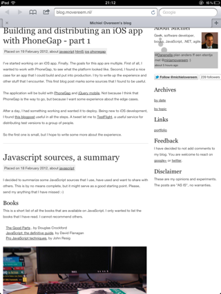
My blog on iPhone and iPad:


Any more tips on CSS3, mobile web and responsive design? Let me know on twitter!
